


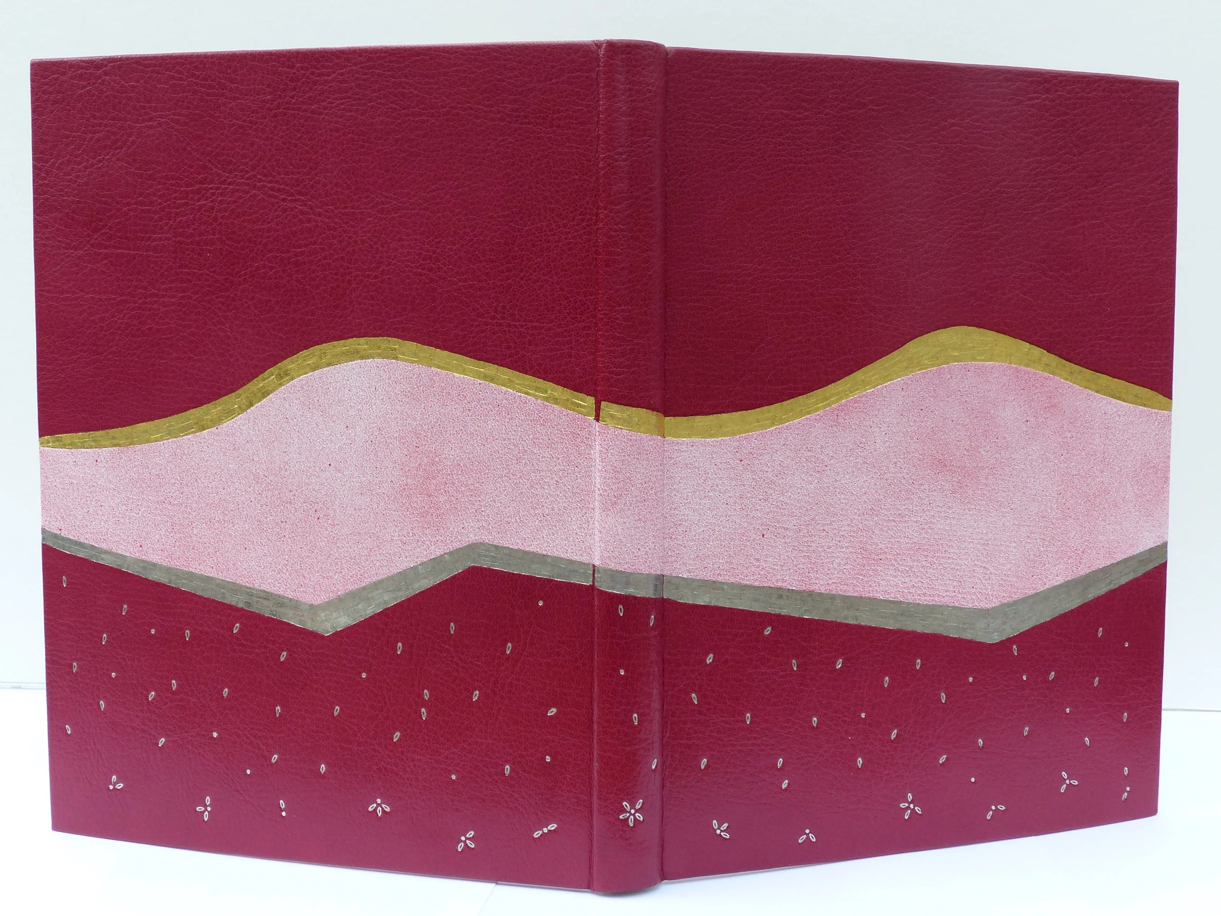


3
Matriarch of the Forest

2
The Helen Fragments

3
The Safe Keep

3
Providence Improved

3
Pollen

2
Of Mice and Men

4
Tom Thumb
2
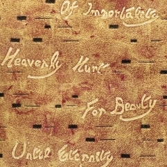
Goethe's Poetry

10
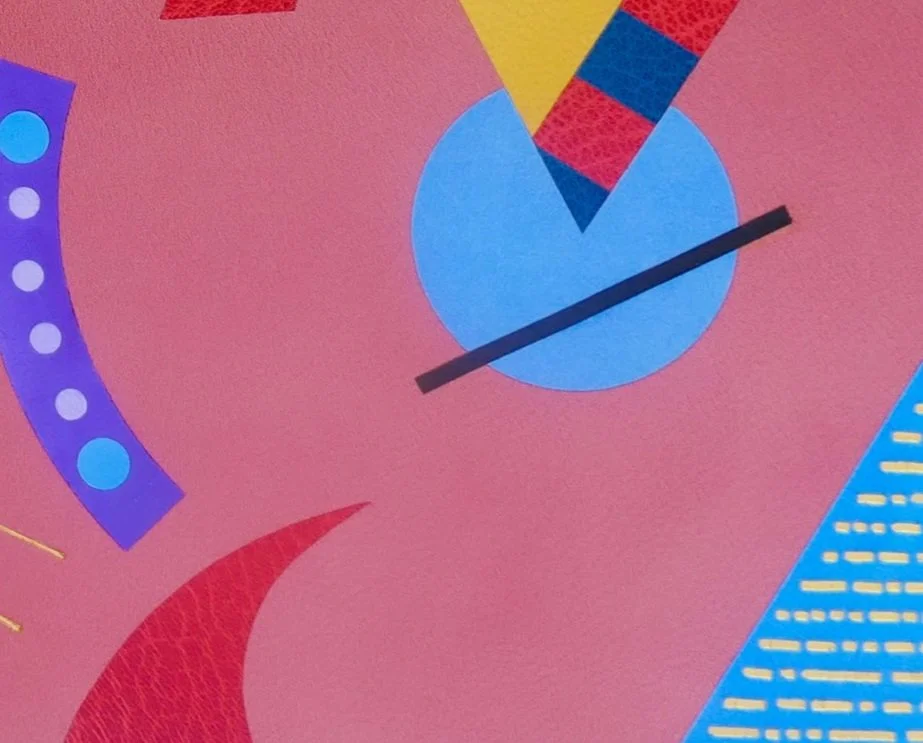
Happy Abstract

5
Hokusai

3
The Book of Revelation

2
The Gardener's Song

1
The Illustrated Man

4
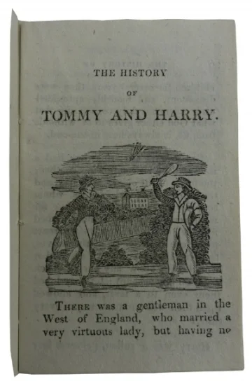
The History of Tommy and Harry
3
EMILY DICKINSON

1
THE NEW HOUSE
1
THE BOOK I'VE READ BEFORE

1
A Shropshire Lad

1
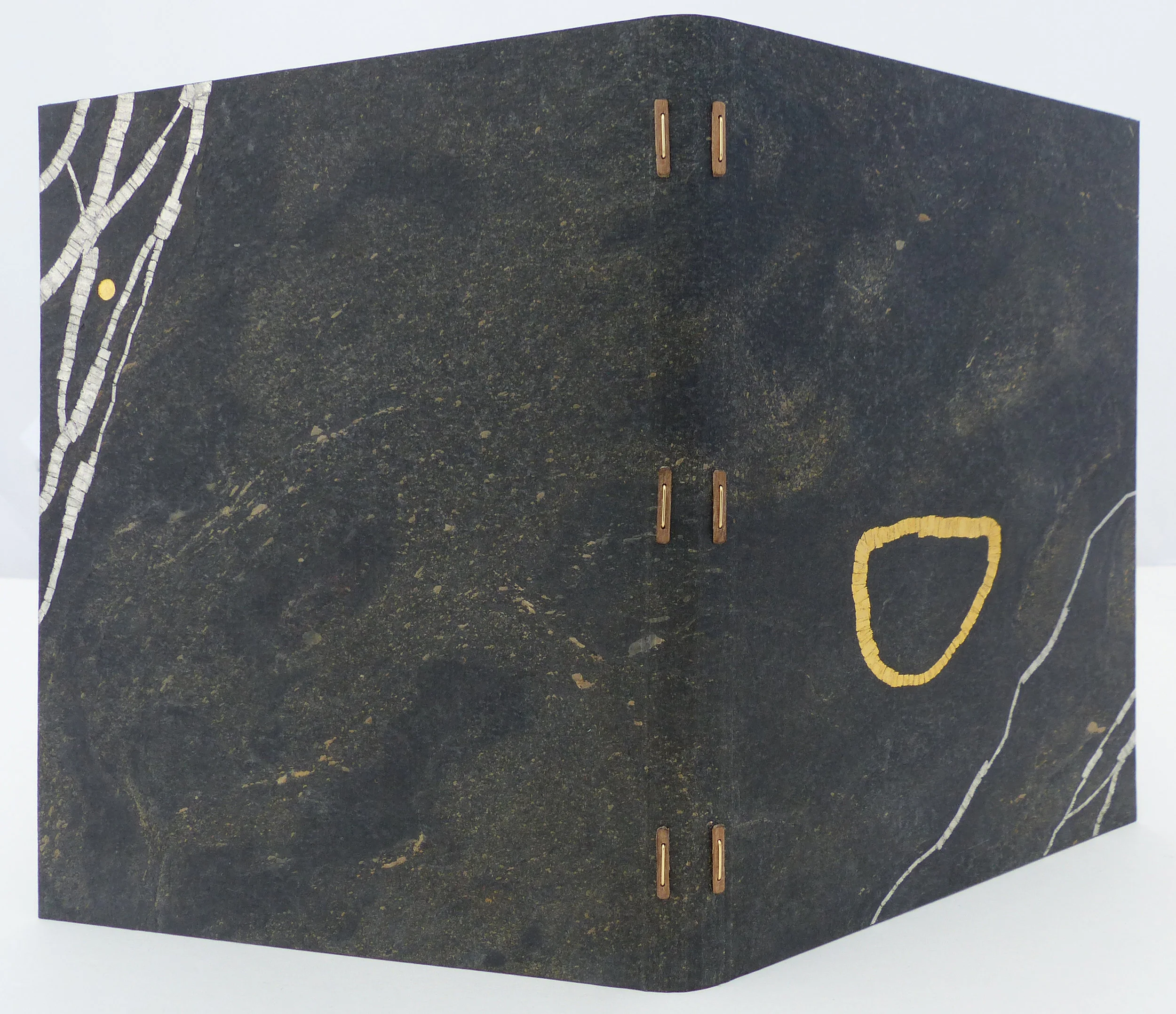
SLATE PANEL

1
VITA NUOVA
5
Venus and Adonis

1
SWEET THAMES RUN SOFTLY

1
BREAKFAST AT TIFFANY'S

1
THROUGH THE WOODS
2
Betjeman Poems

3
Goethe's Poetry
0
New Page